What should the interior of a jewelry shop (categories medium, medium +), located in the store be? What does it mean to observe the harmony between the product and the design of the sales point? Italian architect Claudio Stabile shares experience and analyses the interior solutions of the famous Saint-Petersburg store.
Claudio, do you think, whether the rules of design of a jewelry department in the store and, for example, of the shop on the ground floor of an apartment building differ?
 One of the most important tasks of any shop design regardless of its location is to show the concept of the company which this shop represents. As I have already said in my previous interview (“Navigator for Jewelry Trade”, № 10, 2011) if you create simply a shop, it will not be successful and efficient. To flourish, become popular, bring profit, the shop must bear a certain idea, something that the owner wants to tell, to send the audience. No matter how many shops a businessman opens, they must be united by the common idea, common thought, and common concept. The shops should be recognizable! This must be obligatory for all of them, no matter where the sales point is situated.
I must say, this approach (depersonalization of shops of the same owner, the same brand) was first invented and implemented in America. There the concept for the company is elaborated only once, and then the opening of new sales points is a purely technical task, they are collected as puzzles.
In Russia, the approach was different historically. GUM (State Universal Store), TSUM (Central Universal Store), “Passage”, these shopping centers themselves are works of architectural art, therefore, each of them has its own individual requirements for tenants (in boutique design). As for modern malls, as a rule, the American approach here has the right to exist.
Moreover, united concept for all the salons of the same brand, if they are opened in shopping centers, becomes increasingly topical. Since they have to stand out of dozens of other salons and boutiques, located under the same roof and even abreast. I mean, the shop does not have the right to be faceless and anonymous.
At that, the idea of the shop should fit into the concept of the shopping center. But it is the task of an architect to create harmony between the idea of the company, the product, which it represents, “point of sale”, the place in the shopping centre, and the general interior of the center. To arrange everything in such a way, that absolutely everything works on the presentation of the product: the light, the in-store equipment and the furniture (color, shape, and dimensions), and the color of the walls...
What do you mean speaking about the harmony between the goods and the point of sales? Please, give an example.
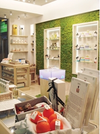
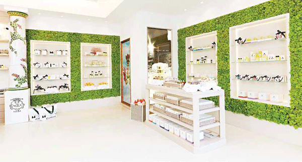
I created a new image for the famous perfume company on Capri, including rearranging of sales points. The company’s shops are located in shopping centers on the island and outside. So, the image should correspond to the cosmopolitan marketing policy of the company.
The client- company produces and sells natural perfume based on Capri herbs, according to the ancient "monastic" recipes, famous since 1600.
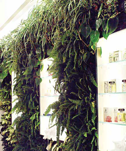
I began to create the interior thinking of nature, naturalness, smells, and introduced "vertical gardens" into the interior. At that I used natural greenery. It was necessary to maintain a certain level of humidity, develop a special ventilation system for normal vital activity of the plants. This idea was well implemented in the stores, occupying separate rooms on Capri, Ischia, Positano and Sorrento.
But it proved to be complicated for its realization in indoor areas, such as, shopping centers. Especially in airports, where there are special requirements to safety systems. But the way out was found! I suggested special herb Cladonia Stellaris, Scandinavian moss, able to survive under lack of light and low humidity.
In other words, I created the interior design with natural product for selling the “natural product”, which can be laid out in any place.
If an entrepreneur does not plan opening a chain of shops and decided to limit himself to one shop, so for him the principle of identity of salons is irrelevant. What to do in this case?

Firstly, you can never deny the possibility of business expansion. In this case the creation of personified design on the basis of the concept of the brand (Swatch, Breil ecc), verified initially, even before opening the first shop, remains relevant. So the creation of each new point of sales becomes just a matter of mounting, assembling; no difference either it is a mall or a city shop.
If for some reasons the expansion of the business is basically impossible, the architect must link the appearance of the shop with the culture and traditions of the place where it is located. To introduce new trends, to use new materials, but not to lose the harmony of the interior with the object of sales: presenting, but not suppressing the shop.
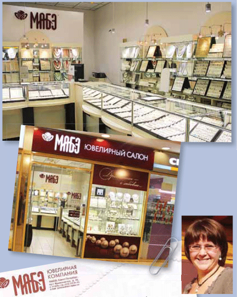
Our partner, the chain of jewelry salons “MABE” agreed to take part in the experiment and presented its interior for your consideration. How optimal is it from your point of view?
First of all, I want to sincerely thank the owner of the shop Marina Vladimirovna Balakshina for cooperation. Such an open position, the desire to improve and develop her business (which is, of course, the main motive that induced the businesswoman to agree to a public analysis of her shop interior) keep out of doubt today’s success of this enterprise and considerable growth of popularity and sales volumes in future. But let's get back to the interior.
With great attention and interest, I have studied the thought-out and positive concept of brand "MABE". The idea of the continuity of classical traditions, preservation and maintenance of the eternal human values (such as love, family ties ...) is close and clear to a modern man. It, no doubt, finds a response in the hearts of the audience, those who come to the shopping center where the salon is located.
This idea, embodied in the slogan "Precious - with Love", in color solution (deep red with mother-of-pearl) and in the visual image, loose pearls, is realized in the design of the outside show-window. And I must say, it quite effectively performs its tasks, - draws visitors’ attention and lures them inside.
But, alas, this interesting concept is not supported by the interior design. The shop’s exterior is much more interesting than the interior...

In my opinion, in the interior design you should make greater use of corporate colors and shades, noble and well-grounded. Rich noble-red and mother-of-pearl colors are appropriate actually everywhere, from the trading equipment to the decor of the walls.
Besides, as it seems to me, you should pay more attention to the lighting. LED systems will allow you to use the variety of color shades: more yellow light will be associated with gold, more white - with diamonds.
As for equipment arrangement, I would rather turn away from show-counters, which visually and psychologically separate the buyer from the shop becoming a kind of barrier between the customer and the product (I must say, this is a classic scheme for Russia). The buyer should be brought, as much as possible, nearer to the product. I understand, there is such an aspect as safety. In Europe, for example, the problem of safety of the product has been solved due to new technologies (ready to share my information in a private conversation).
What would you change first?
The lay-out. Let customers enjoy the freedom of moving in the interior so that they can have a good look and comprehend their purchase in full autonomy. This is the most practical solution. Besides, as the world practice shows, it positively affects the rate of sales and the mood of all participants of the process, buyers and sellers.
Author: Olga Zarzhetskaya

